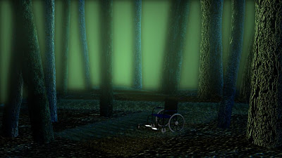
So i spoke to Alan in our Maya lesson today about how to improve the lighting in my uncanny scene, i wanted it to be similar to the concept art i developed for the project. There's still some more things i need to learn and improve on in this image but Alan was really helpful in showing me the different light sources to use for the lighting rig of the environment. He used a combination of spotlight, pointlights, directional light and ambient light to create more atmospheric environment, as well as giving it more depth. I've shown you two examples of the end product, and staright away you can start to see an improvement, in fact you can actually see the image unlike in my original attempt. I also remembered Phil mentioning in the crit that he would liked to have see a betterexploration of camera angles and positioning, so here i have taken his idea of bringing the camera close to and below the wheelchair. This also means that we are able to see the torch beter and it gives the image more of a foreground, mid-ground and background depth; when i add the backgroundin that is. I do like the camera closeup to the wheelchair because it feel quite intimidating, and i feel this will look better when i lear to create 3D fog and add that into the scene. I also want to have a light coming from the torch, which i tried to do using a spotlight, but this didn't seem to work, so i'll speak to Alan about that too.


I like the second image too - you could almost imagine that you are the wheelchair user, and you have fallen out of your chair...and it definitely helps that you can see the torch more.
ReplyDeleteHey Ethan,
ReplyDeleteI know you must feel rather swamped with all the demands of your degree studies - BUT - it's great that you're getting back into this scene - it's already much improved - so well done - and keep at it!
i agree that there's no point in saying oh, i'll improve it next tme cos thats just avoiding the situation... this way i'm able to learn from my mistakes to grow and develop...
ReplyDelete